This site doesn't support your browser.
Improve your experience by upgrading to a newer version of one of the following browsers.
Improve your experience by upgrading to a newer version of one of the following browsers.

This website requires scripts to work correctly. Please enable scripts and reload the page.

This website requires cookies to work correctly. Please enable cookies and reload the page.
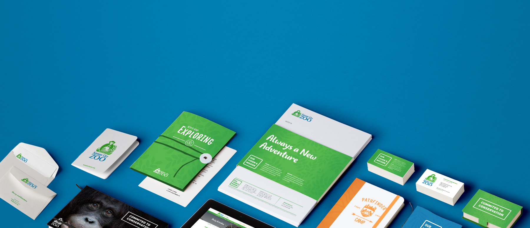
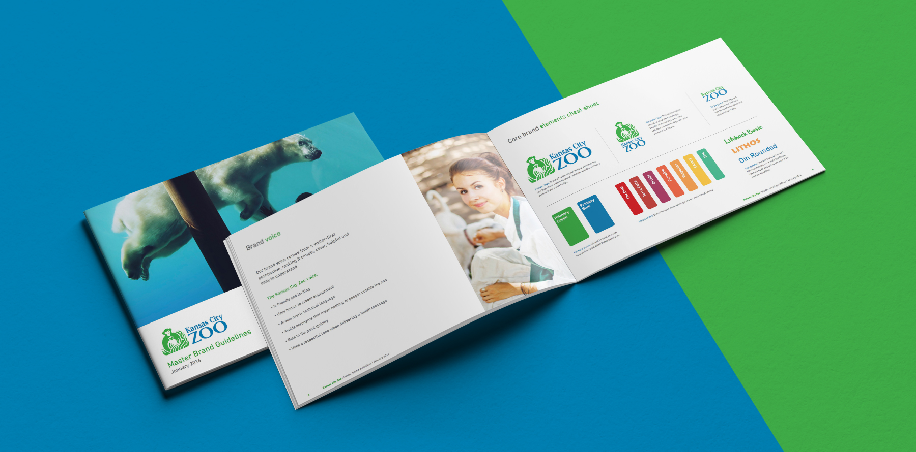
When the Kansas City Zoo wanted to update their brand, they turned to Light Up the Dark. We created a new logo and brand standards that brought more adventure and life to the Zoo’s identity.
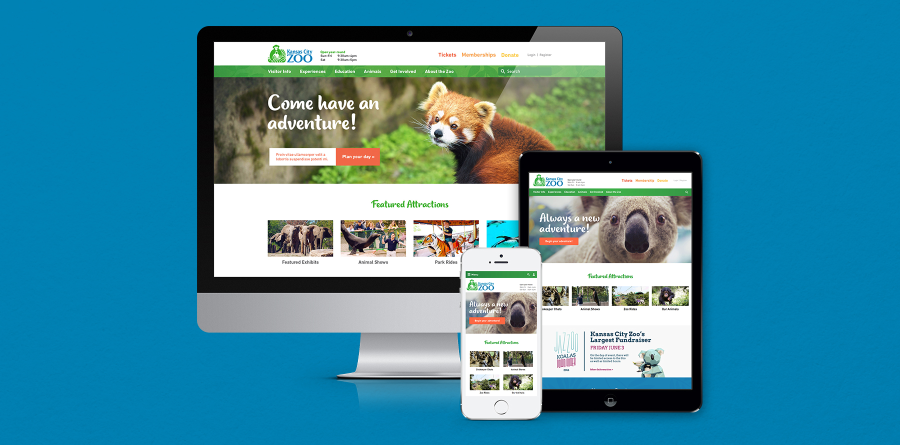
The Kansas City Zoo has been a staple of Kansas City tourism for many years with extensive exhibits prominently featuring African and Australian animals. In 2008, the Kansas City Zoo was voted one of America’s best zoos. We were proud to be approached with redesigning their website and giving their brand a facelift.
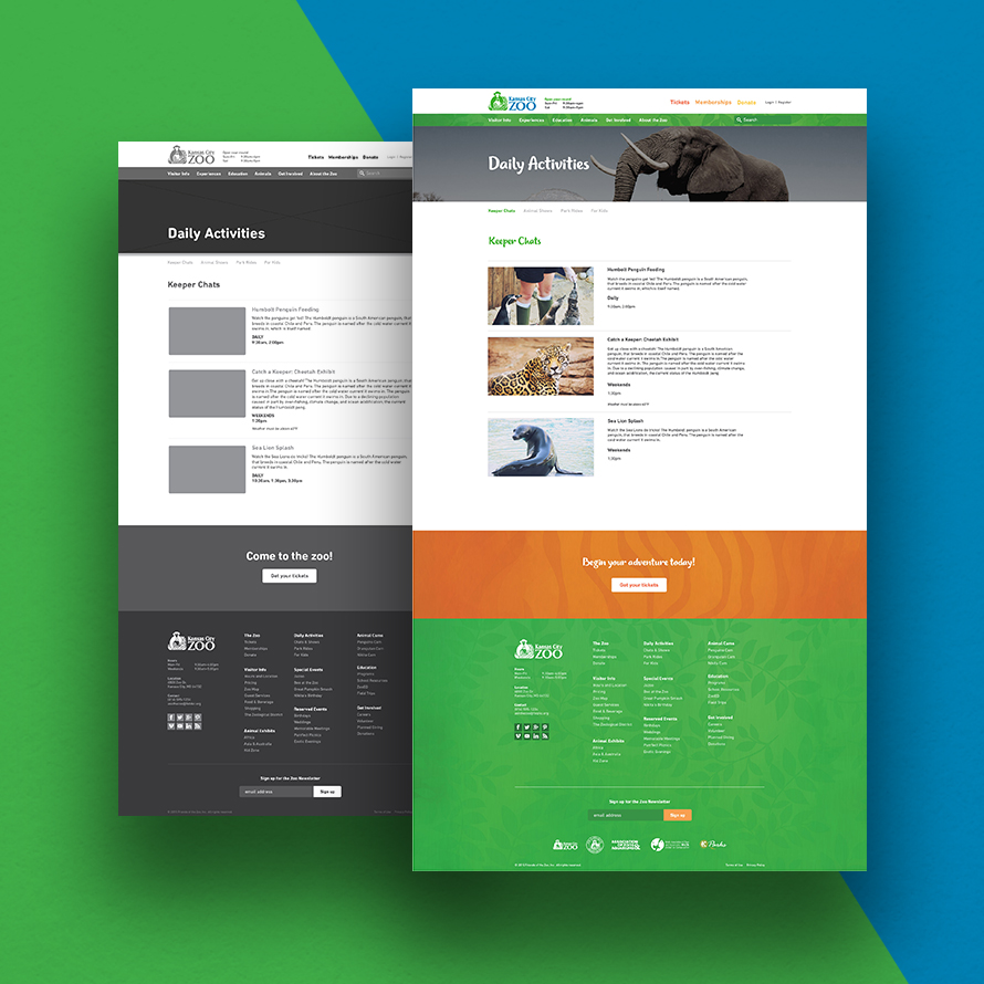
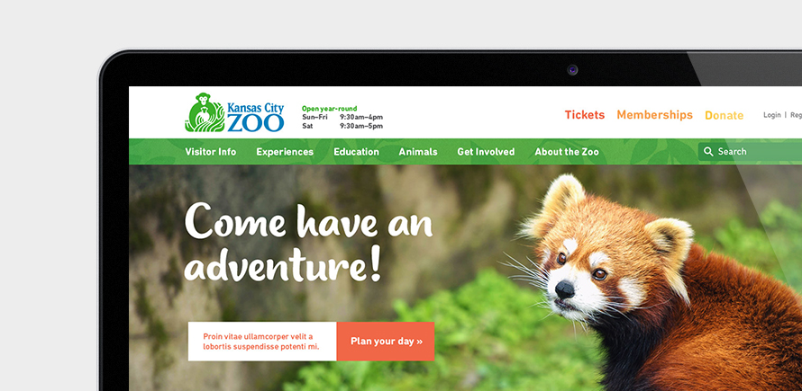
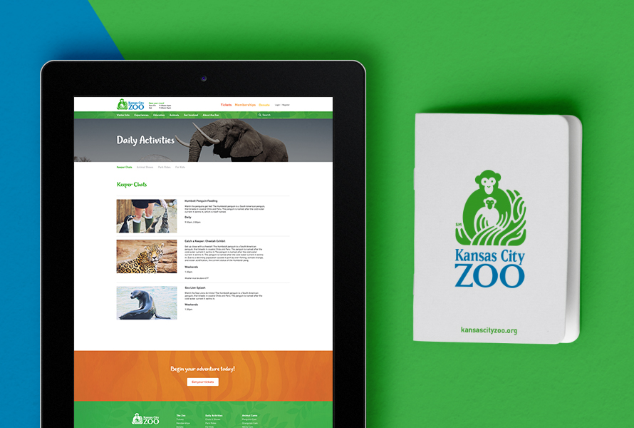
The Kansas City Zoo had two primary needs. First, they needed to refresh and unify their visual identity. Their brand lacked cohesion across their website, marketing materials, park signage, and printed assets. Secondly, they needed a dramatic update to their website which lacked mobile accessibility, intuitive interfaces, and effective tools for their teams to properly display content and manage the website.
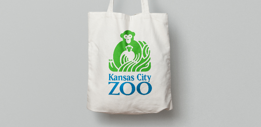
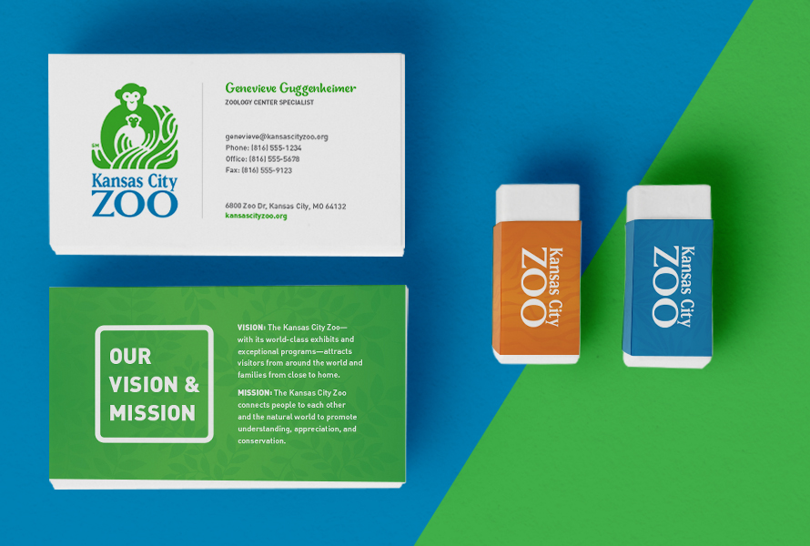
We decided that it would be best to explore an iterative evolution of the logo, rather than explore an entire redesign. We wanted to maintain some of the historic value of the original logo and also maintain awareness of the cost of integration into their current park assets. We decided to focus on cleaning up the logo by fixing several technical errors in the logo and giving it an overall facelift.

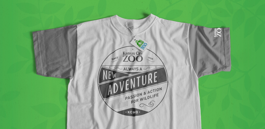
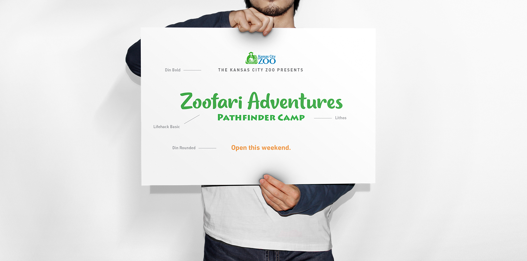
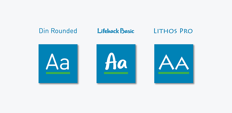
When it came to typography, we selected a system of three type families that would meet all of the diverse needs of the zoo, from their marketing assets to park signage to corporate messaging. These three type families strengthened the brand and brought the correct tools needed to convey the brand's voice.
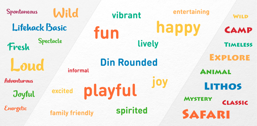
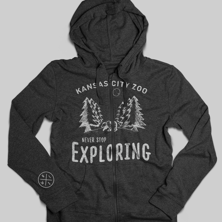
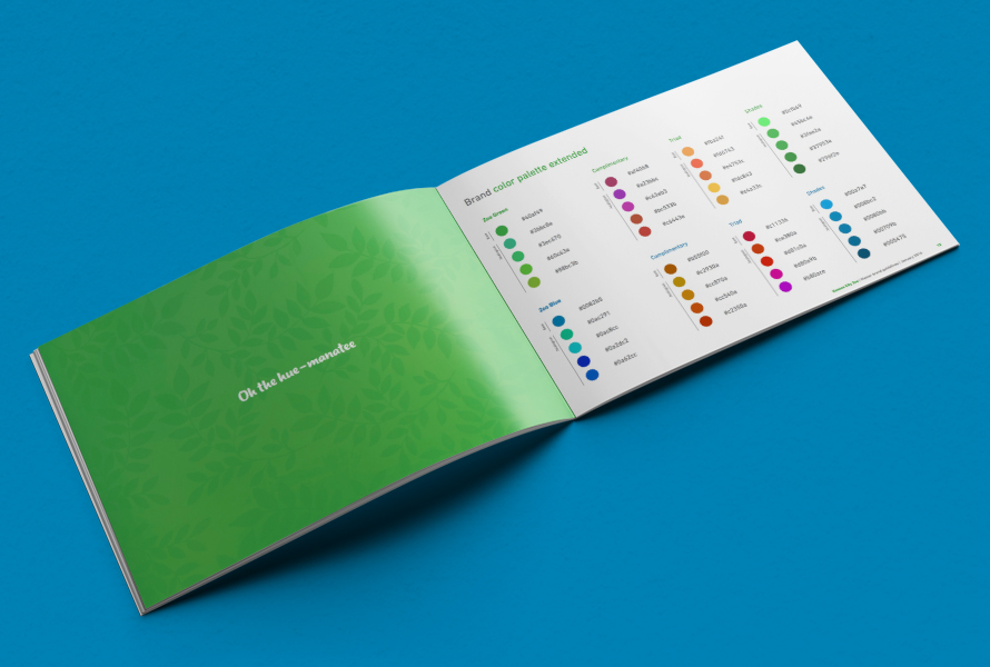
We balanced the incremental update of the logo and typography with a bold new color scheme. We chose bright vibrant colors to reflect the variety of wildlife in the Zoo and to project a sense of adventure and child-like joy that would be approachable to any age.
Our web design team is very happy with how the brand and website for the Kansas City Zoo came together and we are excited to see it in action. We believe it fully captures the sense of wonder, adventure, and joy that a trip to the Zoo brings and we were proud to contribute to a staple of Kansas City culture and tourism.